
People live in Sherburne County because they want space, quiet, beauty, and a small-town feel while remaining close enough to the metro areas to enjoy the work and recreational opportunities bigger cities provide.
People work in Sherburne County because it’s home. They feel a sense of ownership and dedication to this down-to-earth community, devoting themselves to seeing it grow and thrive.
Our people cherish a slower, more authentic lifestyle that transcends fashions and trends. They believe in something more timeless, more “real” than the larger metro areas can provide.
The Sherburne brand is deliberately simple, no-nonsense, but not dull. It captures a “classic” vibe but in a modern aesthetic to avoid it feeling out of touch.
The colors are earthy colors, with enough vibrancy to give the brand energy.
The photography is candid, rather than staged – capturing glimpses of everyday life in our county. These photos feel spontaneous and real, not overly-dramatic.
The copy and voice is warm and straightforward. There's a friendly brevity to it. It is conversational, though not too informal as Sherburne County is an institute of authority.
The tagline has a warm, familiar feel with a tinge of Americana ("The Land of Opportunity"). It doesn't try to be overly-clever or cute. It's honest and to-the-point… an invitation extended to entrepreneurs, families, dreamers of all backgrounds.

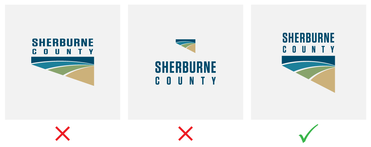
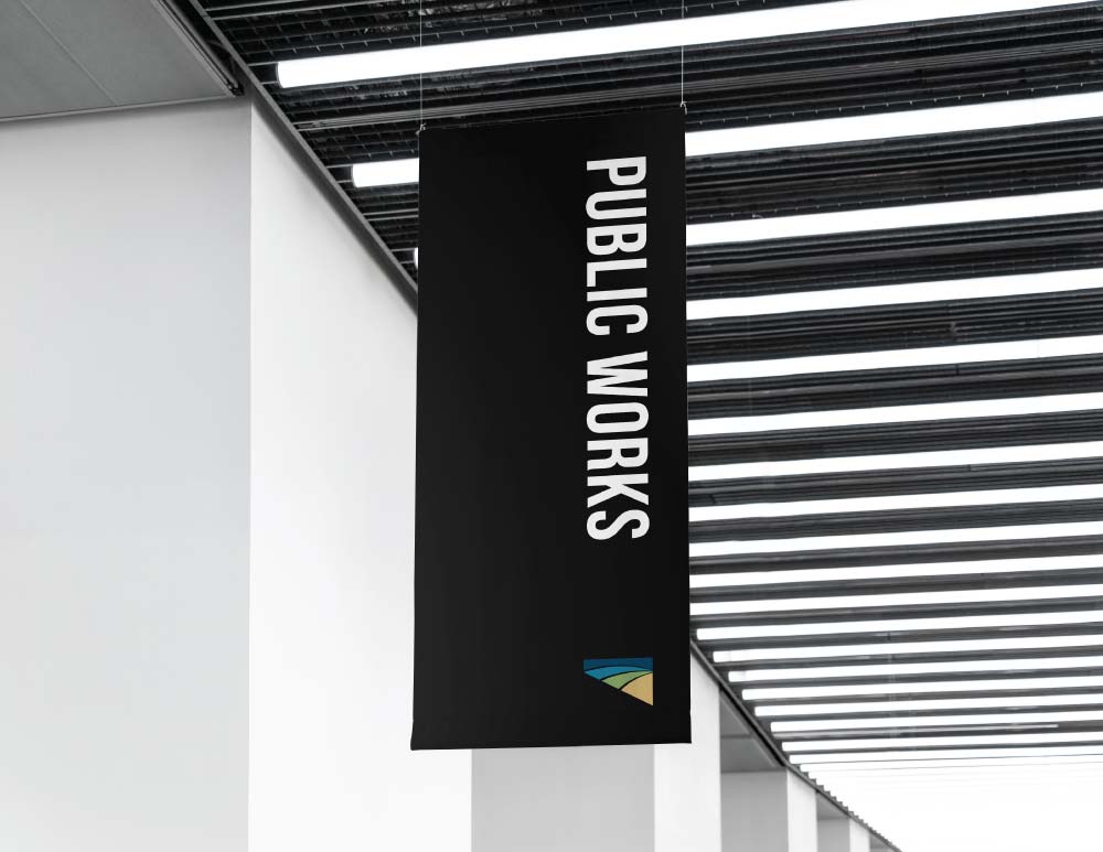
Ensure the logo has enough clear space around it to keep it separate from other elements, ensuring legibility and visual impact.
For each logo variation, the height of the logotype is a good measuring device.
If a logo doesn't read well, try changing to a one-color or white version.
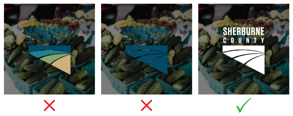
If the logo colors don't work in your situation, try a different logo preset (provided above). Don't change the logo colors.
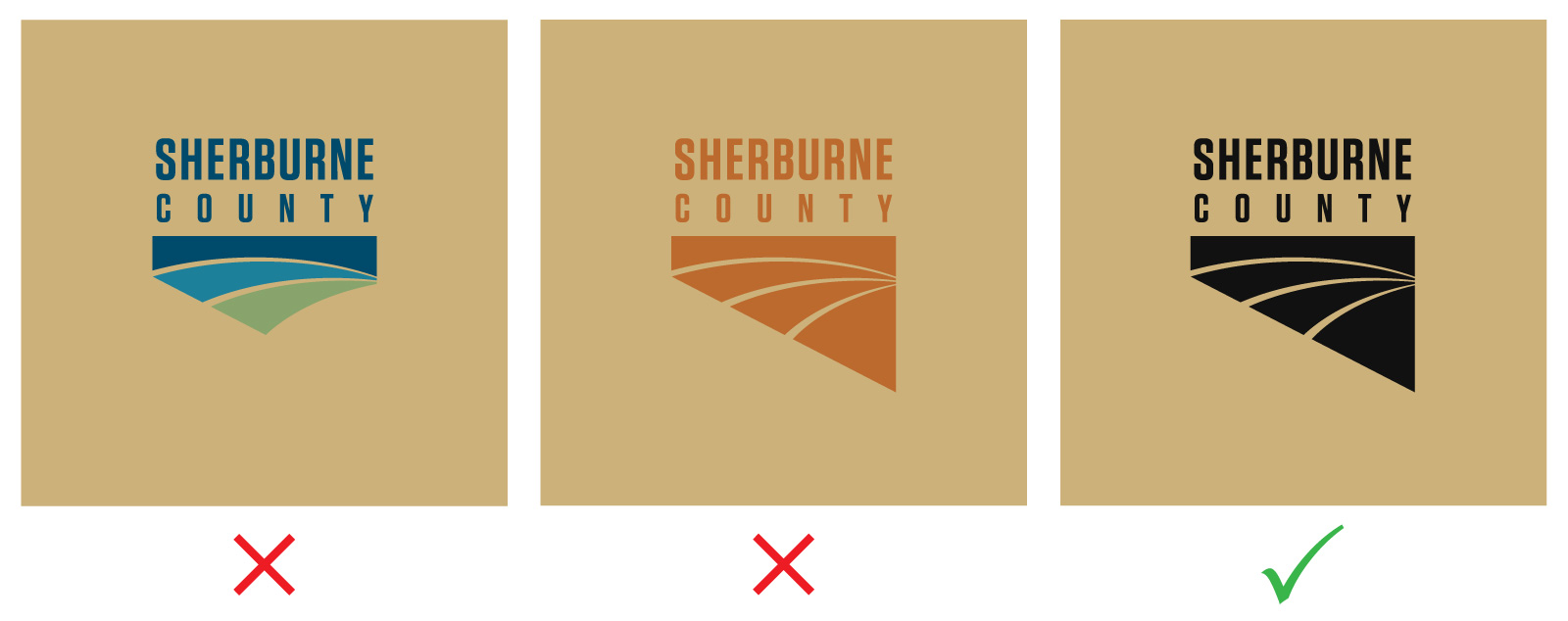
This will hurt the visual consistency that makes the brand recognizable and memorable.
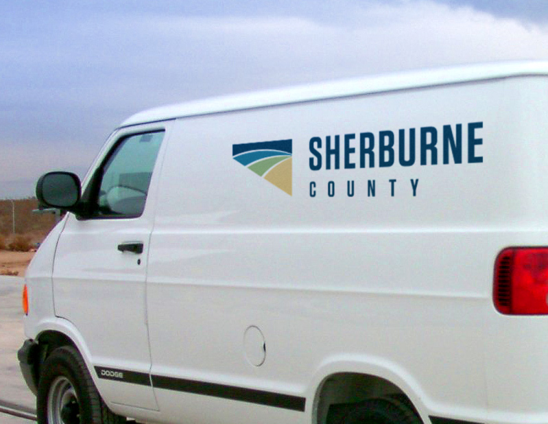
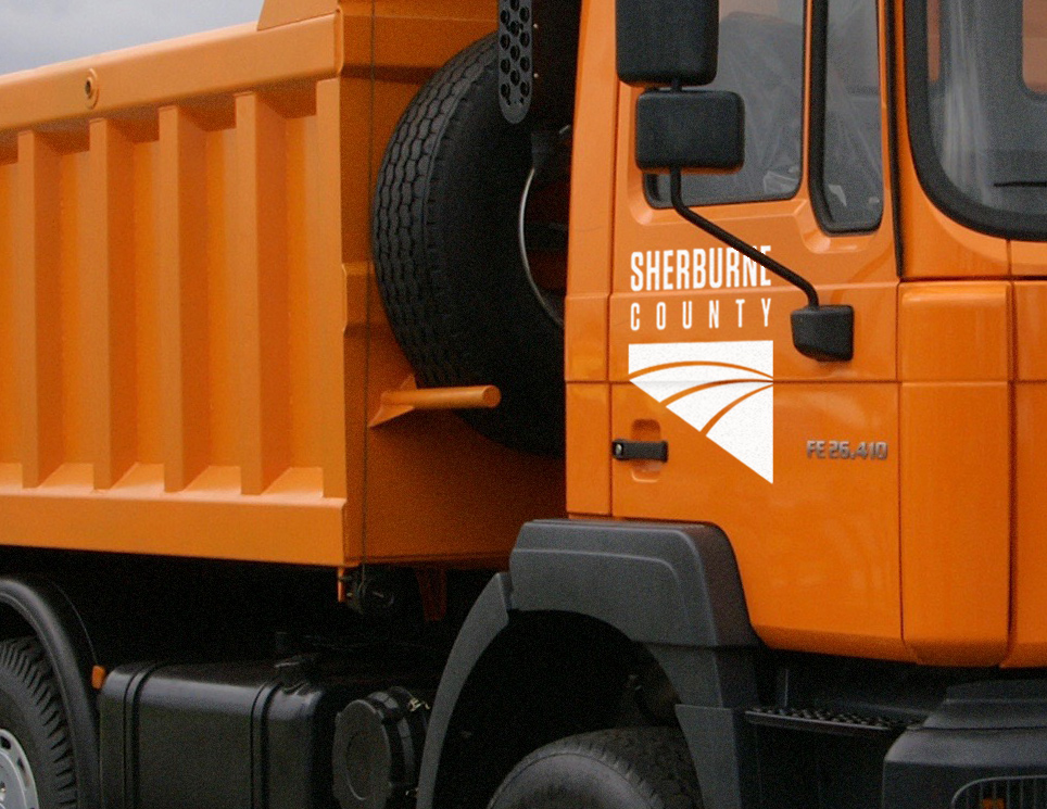
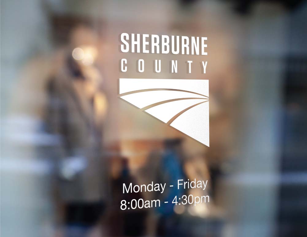
Default to the white Sherburne logo for all vehicles, except for light gray or white vehicles where the logo wouldn't be legible. In these cases use the full-color or single-color logo.
Defaulting to white will ensure the logo will feel consistent across – and match – every possible vehicle's paint color.

There's no need or obligation to color the logo when it's crafted and presented out of natural materials like wood or stone. Let the natural materials be their natural color, if desired.
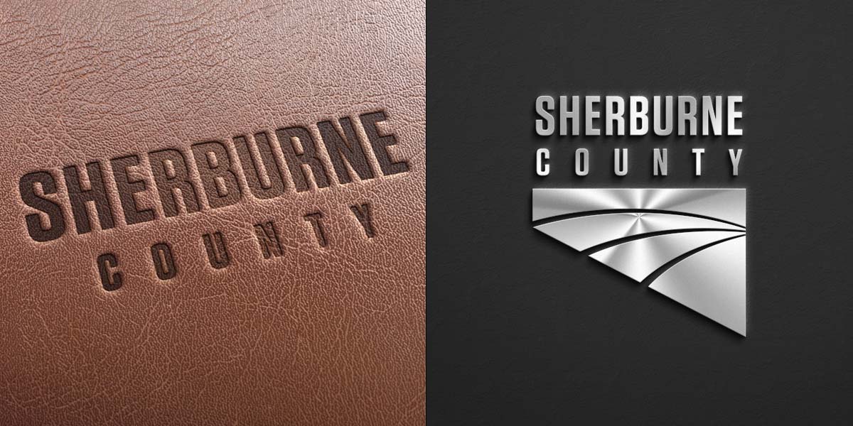
The Sherburne County brand utilizes two typefaces, Bebas Neue and Helvetica Neue.
Helvetica Neue body copy (this text is actually the fallback, Arial, which is a standard web font). Lorem ipsum dolor sit amet, consectetur adipiscing elit. Suspendisse varius enim in eros elementum tristique.
Helvetica Neue body copy (this text is actually the fallback, Arial, which is a standard web font). Lorem ipsum dolor sit amet, consectetur adipiscing elit. Suspendisse varius enim in eros elementum tristique.
Lorem ipsum dolor sit amet, consectetur adipiscing elit. Suspendisse varius enim in eros elementum tristique. Duis cursus, mi quis viverra ornare, eros dolor interdum nulla, ut commodo diam libero vitae erat.
Helvetica Neue body copy (this text is actually the fallback, Arial, which is a standard web font). Lorem ipsum dolor sit amet, consectetur adipiscing elit. Suspendisse varius enim in eros elementum tristique. Duis cursus, mi quis viverra ornare, eros dolor interdum nulla, ut commodo diam libero vitae erat.


The Sherburne County brand generally favors neutral tones – whites and blacks – to big washes of color. Color is used as an accent, adding small bursts of vibrancy to the clean designs.
HEX: #004a6b
RGB: 0, 74, 107
CMYK: 99, 69, 37, 21
302U
HEX: #1f809b
RGB: 31, 128, 155
CMYK: 84, 38, 30, 3
314U
HEX: #87a46c
RGB: 135, 164, 108
CMYK: 51, 21, 71, 2
7490U
HEX: #ccb27a
RGB: 204, 178, 122
CMYK: 21, 27, 60, 0
7403U
HEX: #111111
RGB: 17, 17, 17
CMYK: 73, 67, 66, 83
Used primarily for headlines, emphasized text, and dark backgrounds.
HEX: #676767
RGB: 103, 103, 103
CMYK: 59, 51, 51, 20
Used for web body copy and subtle text on dark backgrounds.
HEX: #dddddd
RGB: 221, 221, 221
CMYK: 12, 9, 10, 0
Used to define or differentiate a section of content on a document or website. Also used for horizontal rules.
HEX: #f5f5f6
RGB: 245, 245, 246
CMYK: 3, 2, 1, 0
Another color option to define or differentiate a section of content on a document or website.
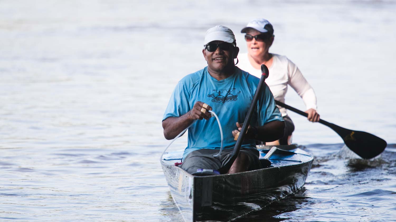
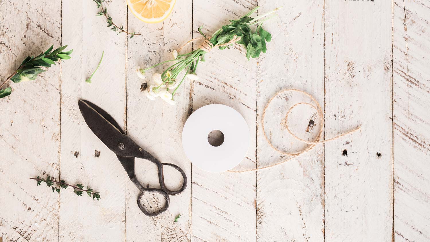
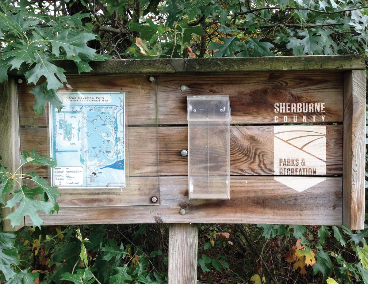
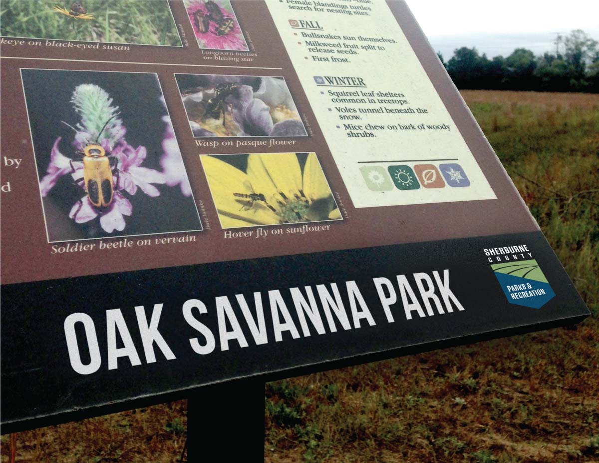
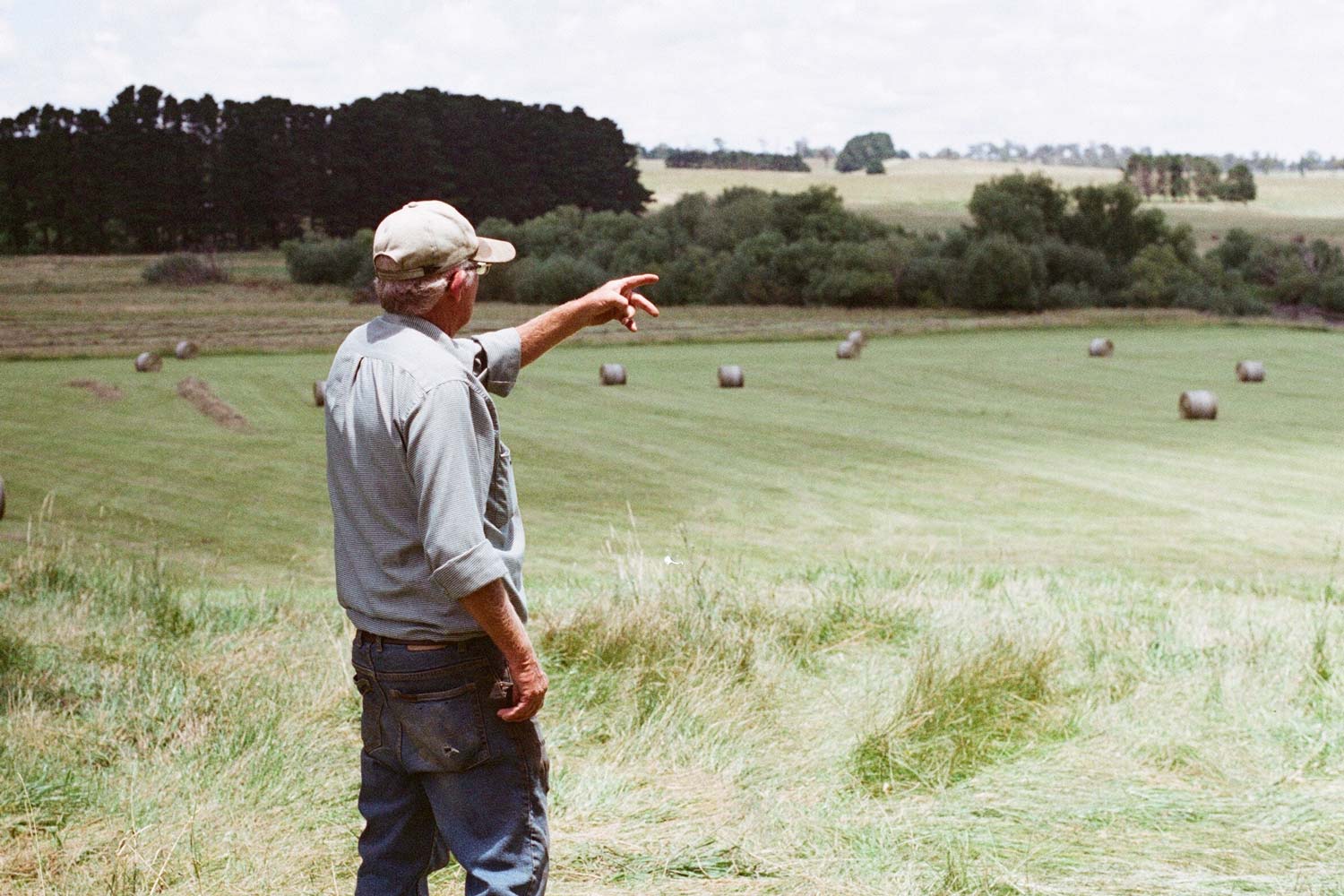
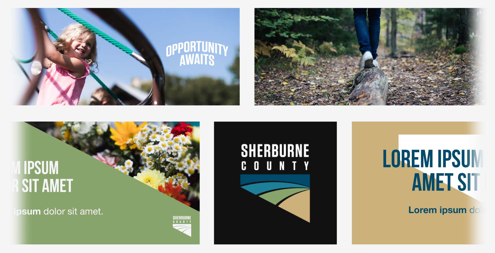
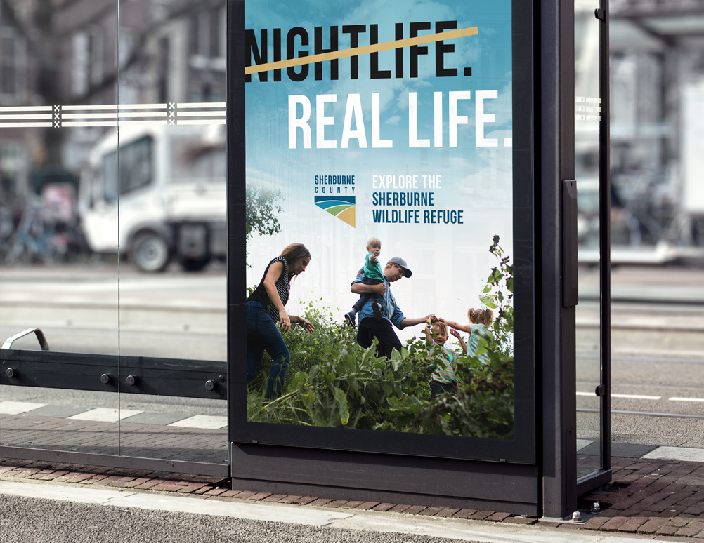
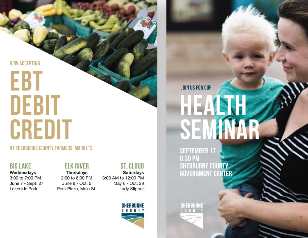
As mentioned earlier, Sherburne County's photography style is candid and spontaneous, rather than staged. We're giving people little glimpses into the genuine everyday life of work, play, community, and leisure.
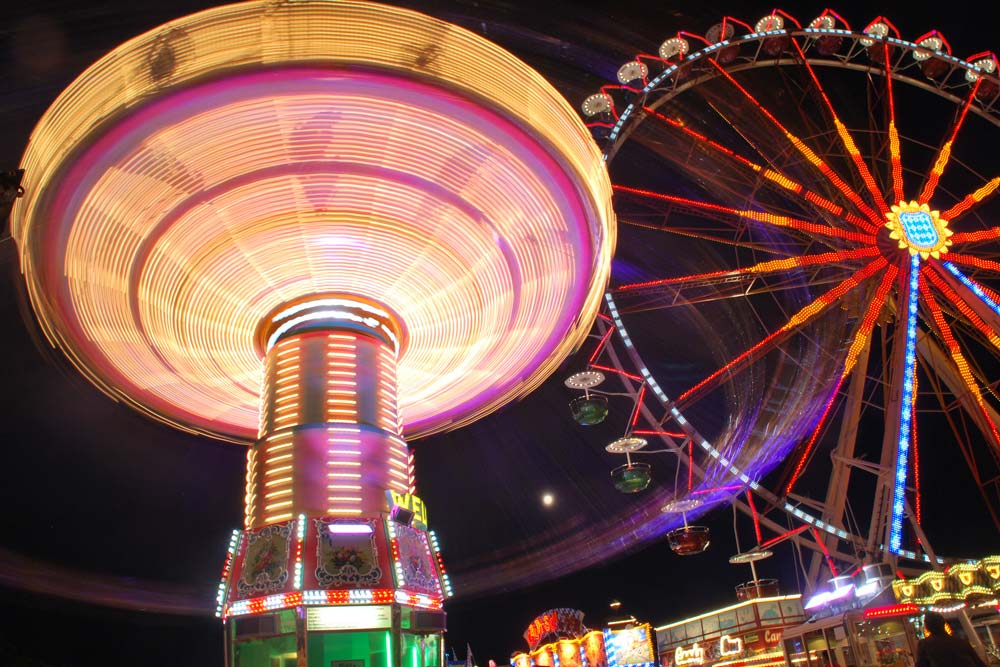
If it's necessary to use stock photography, try and select images that match the same candid, crisp visual qualities of our original photos. Here are two great stock photo resources, both containing free photos for unrestricted use.*
*On Flickr.com, make sure to filter search results by "no known copyright restrictions."

Unless they fit the context perfectly and feel "genuine."

Unless they're true-to-life.

These photos can set the stage, create a mood, or even imply people without showing them.